Buy ebook

CSS Mine

Get my e-book focusing on CSS3 and
modern web UI development.

Learn more

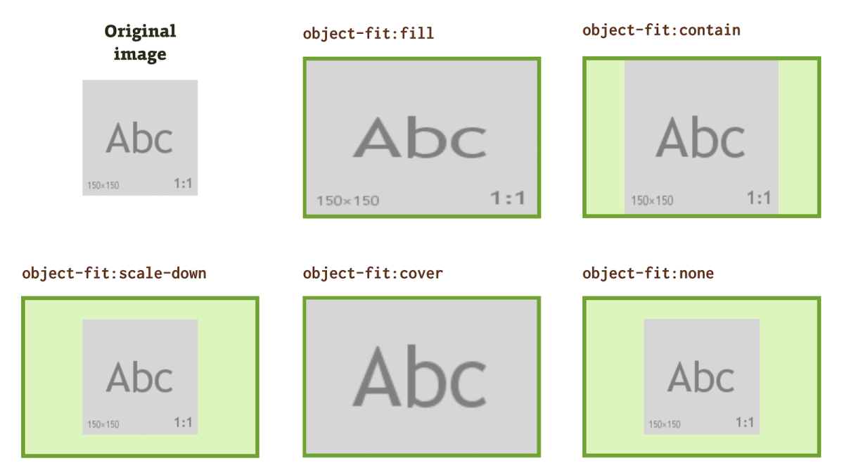
The properties object-fit and object-position are used to specify the size and position of external media inserted into HTML, mainly the images within the <img> tag, but also the content of the <video>, <iframe>, or <embed> elements.

The properties are not supported by Internet Explorer, therefore they are more useful for projects where it’s not that important.

object-fit and object-position can be viewed as parallel to the image properties background-size and background-position. Only that these are intended for elements inserted directly into HTML.

CSS properties object-fit and object-position

Figure: The object-fit and object-position properties determine how the inserted media behaves when its dedicated space becomes smaller or larger.

Let’s show it on a simple example.

We have the following HTML:

<img class="img img--cut" src="image-300x300.jpg"
  width="300" height="200" alt="Image…">

CSS:

.img--cut {
  object-fit: cover;
  object-position: bottom;
}

And let’s explain:

  • The image has natural dimensions of 300x300 pixels, but it is only allowed to occupy the height of 200 pixels in HTML, see the height property.
  • object-fit:cover indicates that the image should be stretched over the entire area of the <img> element so that there is no space left. See object-fit.
  • object-position:bottom specifies the alignment to the bottom edge of the <img> element surface. See object-position.

Object-fit values

Specifies how to fit the external media to an area specified by the width and height properties in HTML or CSS.

CSS property object-position

Figure: Object-fit property values applied to an image of 150 × 150 pixels.

This is very similar to embedding images to background using the background-size property.

Values What does it do?
fill (default) Fills the entire area. It can distort the aspect ratio of the content but does not crop it.
contain It does not always fill the entire area. The content does not distort or crop, it displays the entire content.
scale-down Same like contain, but it never enlarges the image beyond natural size.
cover Fills the entire area. Does not leave empty space, does not distort content, only crops it.
none Keeps original size and aspect ratio. Sometimes cropping, sometimes leaving free space.

Figure: In practice, the most useful value is object-fit:cover.

Object-position values

Defines where will be the element positioned by using object-fit. It has exactly the same values as the background-position property.

CSS property object-position

Figure: Examples of object-position property values.

Let’s look at examples of values.

Value example What does it do?
50% 50% (default) Centers the object in the middle of the rendered box.
0 0 Places the object in the upper left corner.
0 -50px 0px from the top and 50px to the left outside the rendered box.
top right To the top right corner.
bottom On the lower edge. The second value is taken as the default, ie center.

Use in practice

Support in browsers

Since the Edge explorer has been upgraded to the Chromium rendering engine, only Internet Explorer 11 does not support these properties.

By the time I am writing this article, Internet Explorer still has a significant share of users in some countries (like for example here, in the Czech Republic), so it will be necessary to sort out the fallback.

caniuse.com/object-fit

How to solve the problem in Internet Explorer:

  1. Instead of object-fit/object-position embed the image to the background by using background-size/background-position. Alternatively, you can play with the transform property and with absolute positioning (See StackOverflow).
  2. For IE11 use polyfill - fregante/object-fit-images. I do not recommend it much, because it slows down the rendering performance in the already slow Explorer.
  3. Detect a non-supporting browser (eg. using the Modernizr library) and deploy a workaround. For example, StackOverflow offers a solution to change <img> to <svg> and resolve the problem in it.

Share article: Facebook Twitter Google+

Martin Michalek

Author: Martin Michalek

Freelance front-end designer based in Prague, the Czech Republic. Technical writer who gives lectures about CSS3, responsive design and modern web UI development.
E-mailFacebookTwitter

Buy ebook

CSS Mine

Get my e-book focusing on CSS3 and
modern web UI development.

Learn more