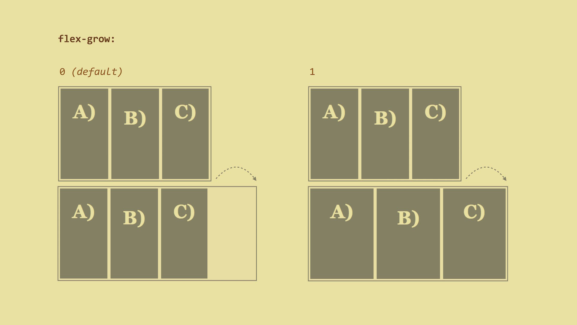
flex-grow – The Ability To Grow
How much can the item grow relative to the rest of the flexible items when there is free space? When a user resizes the browser window for example?
CSS Mine
dig into web UI development

flex-grow – The Ability To GrowHow much can the item grow relative to the rest of the flexible items when there is free space? When a user resizes the browser window for example?
The possible values:
0 (default), which means that items will not grow.Live demo: http://cdpn.io/e/GqrVzL
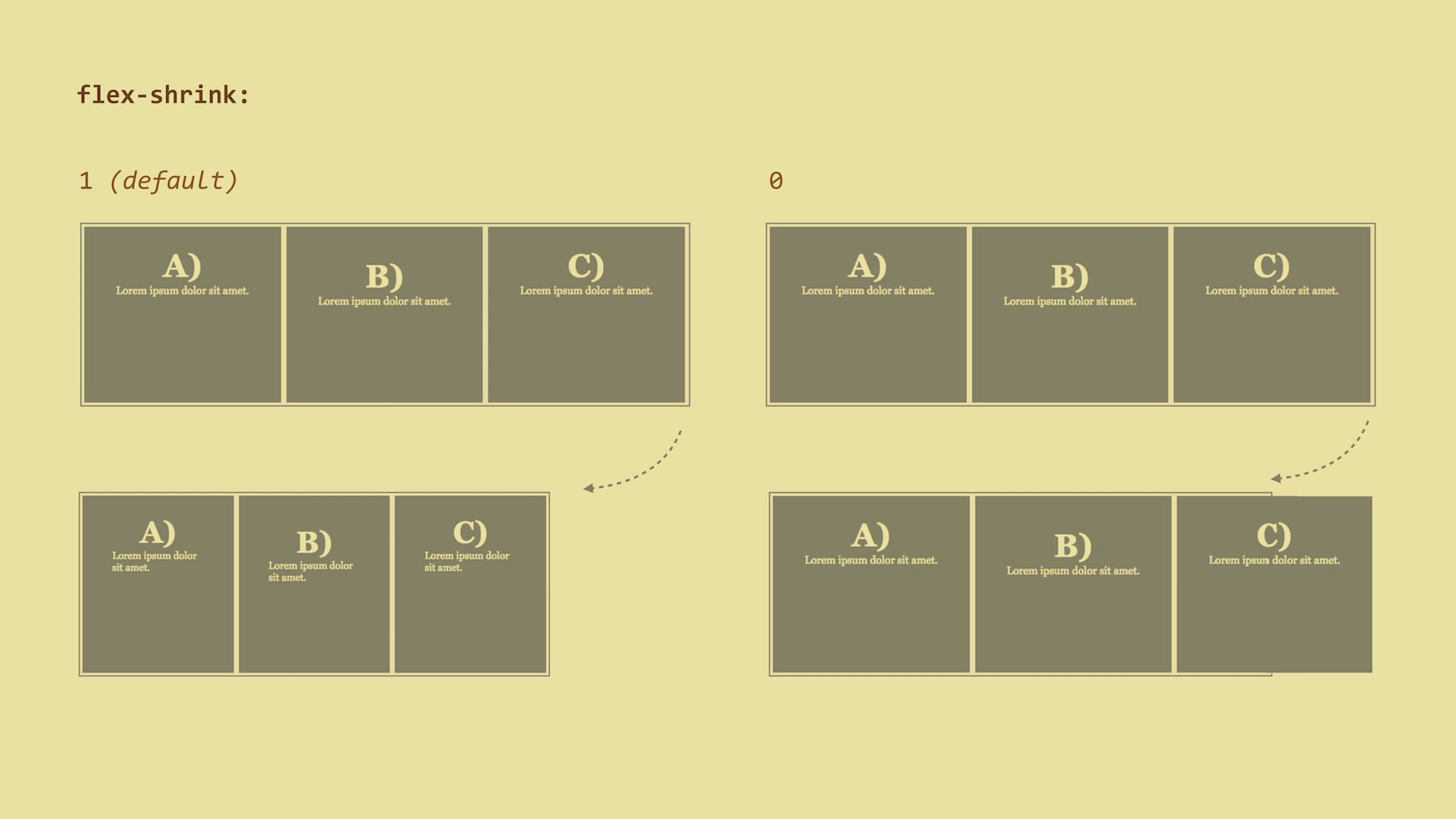
flex-shrink – The Ability To ShrinkHow much will the flex item shrink relative to other items when there is not enough space in the parent element? When a user resizes the browser window or a new item is added, for example.
The possible values:
1 (default), which means that items will reduce their widths equally.Live demo: http://cdpn.io/e/PzWMvM
flex-basis – Default Item SizeThis is the default width of the item (or default height when using
flex-direction: column).
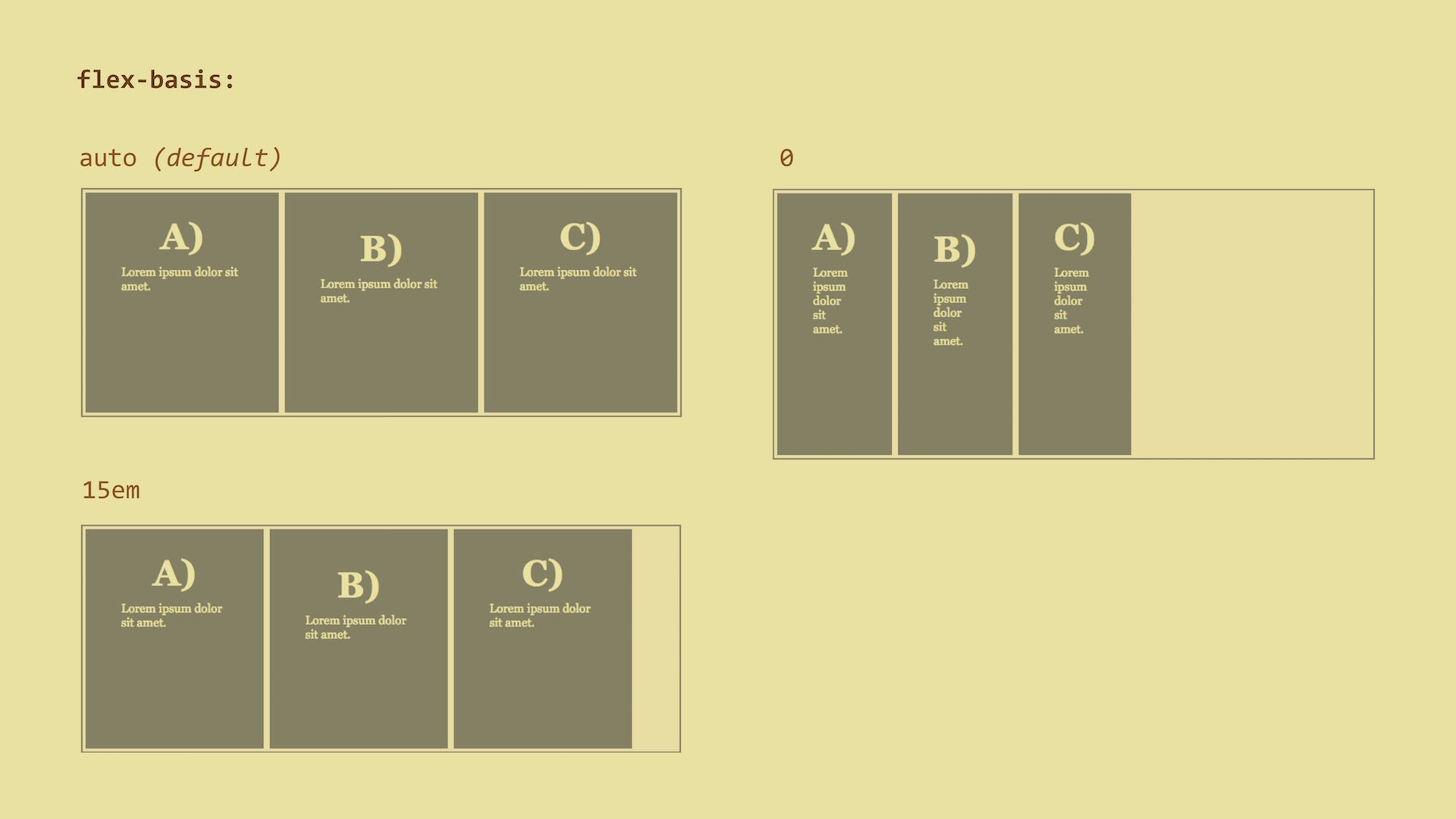
auto (default) – the width is defined by the content, similar to width: auto. The distribution of free space using the flex-grow/flex-basis
properties will then affect just the extra space that is taken up by items
beyond their initial size - the so-called relative flex model.0 – size of the content is not an issue. The distribution of free space
using the flex-grow/flex-basis properties will then affect the whole width
of the item – the absolute flex model.100px, 15em, 50% - or any other CSS size.Live demo: http://cdpn.io/e/oLZvgQ
flex – Overall Item FlexibilityThis is a shorthand for all properties that define the flexibility of an item:
flex-grow, flex-shrink and flex-basis. It sets the default element size
and tells us how an element can grow and shrink.
It is good to know that the authors of the specification recommend using the
flex shorthand rather than the particular properties which it represents. This
is because the shorthand itself can set default values.
flex:
  _flex-grow_ _flex-shrink_ _flex-basis_
The default value is:
flex: 0 1 autoflex-grow: 0 - the item will not expand to fill free space.flex-shrink: 1 - it will shrink just as all other items.flex-basis: auto - it will take up space defined by its own content.Let’s assume you want your items to take up a minimum of 150px and if there is
enough free space available, to expand equally. On the other hand, if there is
not enough free space, you want them to shrink equally. You will do it like
this:
flex: 1 1 150pxHowever, I think you are better off using pre-defined “intelligent” values:
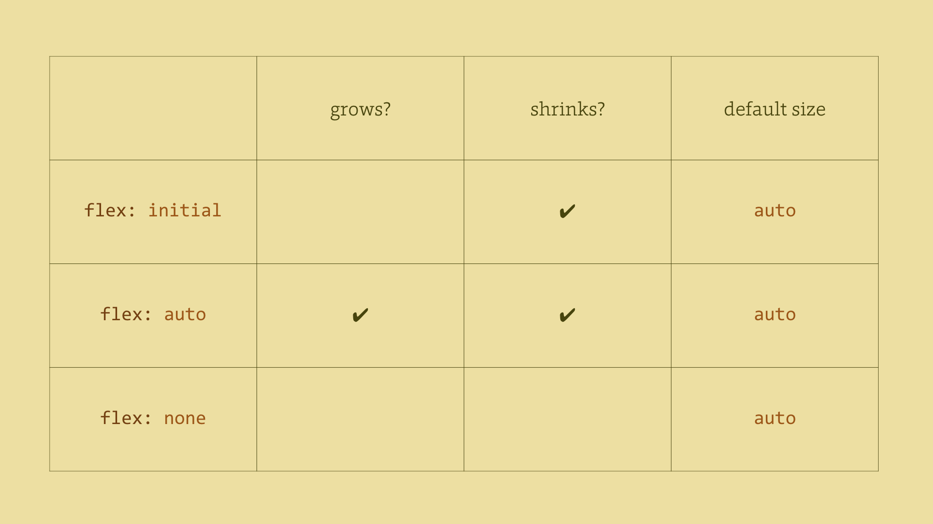
flex: auto
This corresponds to flex: 1 1 auto. The items in question will become
fully flexible, having a default width based on their contents. This is
probably the most common case.flex: none
This corresponds to flex: 0 0 auto. It cancels the flexibility of the
item. This is the second most common case.flex: initial
This resets values to the default, i.e. to flex: 0 1 auto. If there is not
enough space, the items will shrink. However they will not expand beyond the
size of their contents.flex: <positive-number>
Watch out if you use a single number here! The flex: 1 declaration stands
for flex: 1 1 0 so the default size of the item and flex model will be
changed. I have already mentioned this in the flex-basis property section.It is also good to know that flex items will never shrink below their minimum
content size. This size is defined by the length of the longest word or
fixed-size element – e.g. an image. It can be changed by setting the min-width
or min-height properties to a low value.
order – Changing the Order of ElementsThe order of flex items corresponds to the HTML code. However, we can change
that using the order property.
A change in the order affects the visual position of an element rendered by a
browser. It does not affect the actual order of items, i.e. when using a
document reader or going through the navigation using the Tab key.
The default value is 0 which basically means that it will correspond to the
“actual HTML order”.
When using the following notation, you can make the third item visually appear to be the first one:
.flex-item-third {
  order: -1;
}
But remember that you can’t use order on other elements of the page except the
direct children of the flex container.
Live demo: http://cdpn.io/e/JoqxJe
margin – Aligning Main Axis Items Within an ItemThe margin: auto declaration works similarly to block elements. When
calculating the size of flex items, the auto value does not matter. Free space
is equally distributed among all margins.
This allows you to set margin-left: auto, extending the left margin of an
element with left margin and pinning the item to the right. You can use this
instead of the float property.
All other “alignment properties” use similar values, however they apply to different sets of flex items or different container axes.
align-self – Aligning Cross Axis Items Within an Itemalign-self:
auto | flex-start | flex-end |
center | baseline | stretchThis property is applied to each item, so it is suitable for creating alignment
exceptions. The default value is auto.
Live demo: http://cdpn.io/e/OXWKwe
Notice the alignment at the baseline of the first line. The item with the
greatest size between the baseline and the upper edge (the topmost one) will be
pinned to the upper edge of the flex container. You can see this in the previous
image or at cdpn.io/e/QwobXz.
Note that flexbox will not corrupt the upper pixel padding.
So, is all clear now? Ok, now let’s move on to browser support.
Published under Creative Commons license
Attribution-NonCommercial 3.0 Unported.
martin@cssmine.com
—
Vzhůru dolů